LunchBox is a designed solution to the problem: how do busy individuals have time to plan what they're going to eat?
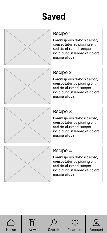
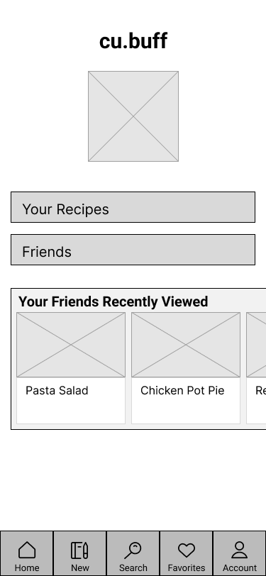
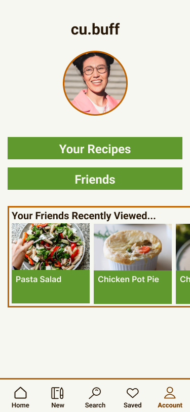
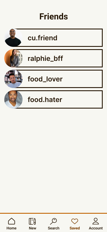
My solution: an app that is part recipe book, part meal sharing social media. With the recipe book, you are able to search, create, and save recipes that you enjoy for future use. With the sharing side of the app, you are able to add friends and see what recipes they enjoy
With this concept, I hope to streamline the meal selection process for those who simply don't have time to plan an extravagant meal but still want to eat a delicious meal.
Designer: Sam Lippincott
Role: UX/UI Designer, Researcher
Timeline: Mid August - December 2022
Tools Used: Figma, Unsplash, Coolors, MURAL
Scope: A Figma proposal for an auxiliary tool for those who have the capability to cook their own meals, but feel uninspired when it comes to deciding what they want to cook. I'm not looking to reinvent the wheel, simply provide support
Research
Ideation
This project was developed while I was in University, and was trying to keep up with the constant barrage of assignments. Planning what I would eat that day was not my highest priority. I kept wishing there was essentially a menu for what I could eat that evening, but alas I do not live in a restaurant. Talking to my peers, they felt similarly. Thus, the idea for LunchBox materialized.
Goals
Create an easy-to-use digital recipe book of your favorite meals, as well as providing a way for you to share recipes with your friends.
User Interviews
Six user interviews were conducted with the target demographic: busy college students like myself. Below are samples of the questions that were asked of the interview participants.
• How often do you cook your own meals?
• How do you usually find recipes?
• How do you manage time to cook between assignments?
• What are your strategies for planning meals throughout the week?
• How do you keep track of recipes you enjoy?
• Do you cook with others?
Affinity Mapping
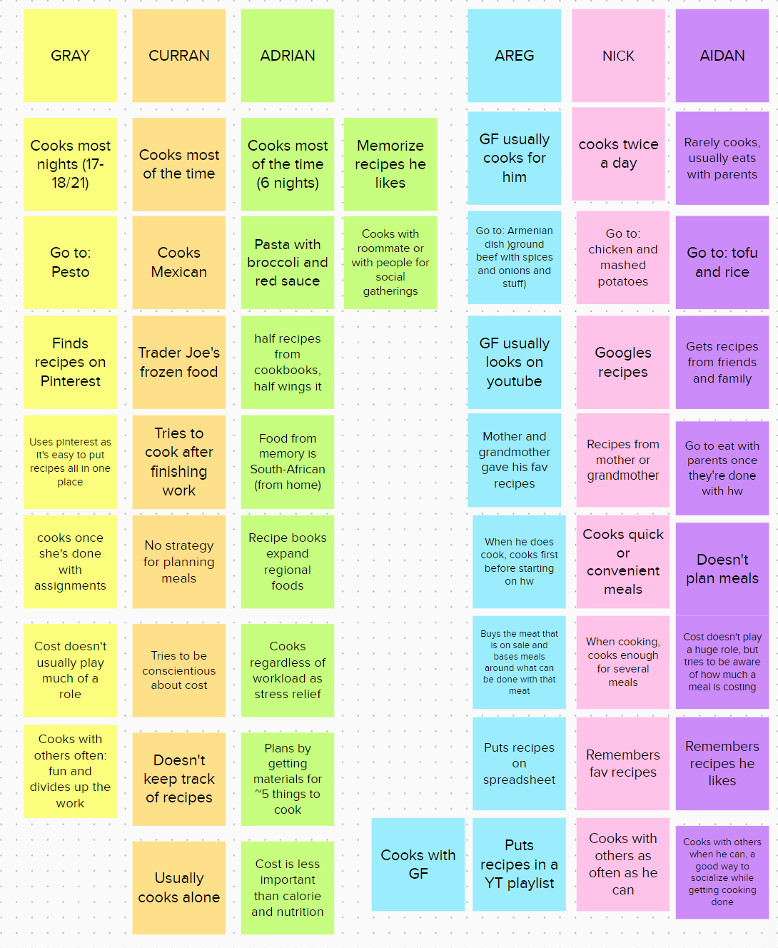
From the six interviews I gathered responses such as:
• "Some of my favorite recipes are from my mother and grandmother"
• "I try to cook after I finish all my assignments for the night"
• "I find recipes on Pinterest"
• "When I cook, I cook enough for several meals, so I don't need to cook as often"
• "My girlfriend and I collect the recipes we like on a spreadsheet"
I collected all the responses to each interview question and and organized them by similarity in hopes of finding patterns of common feelings.
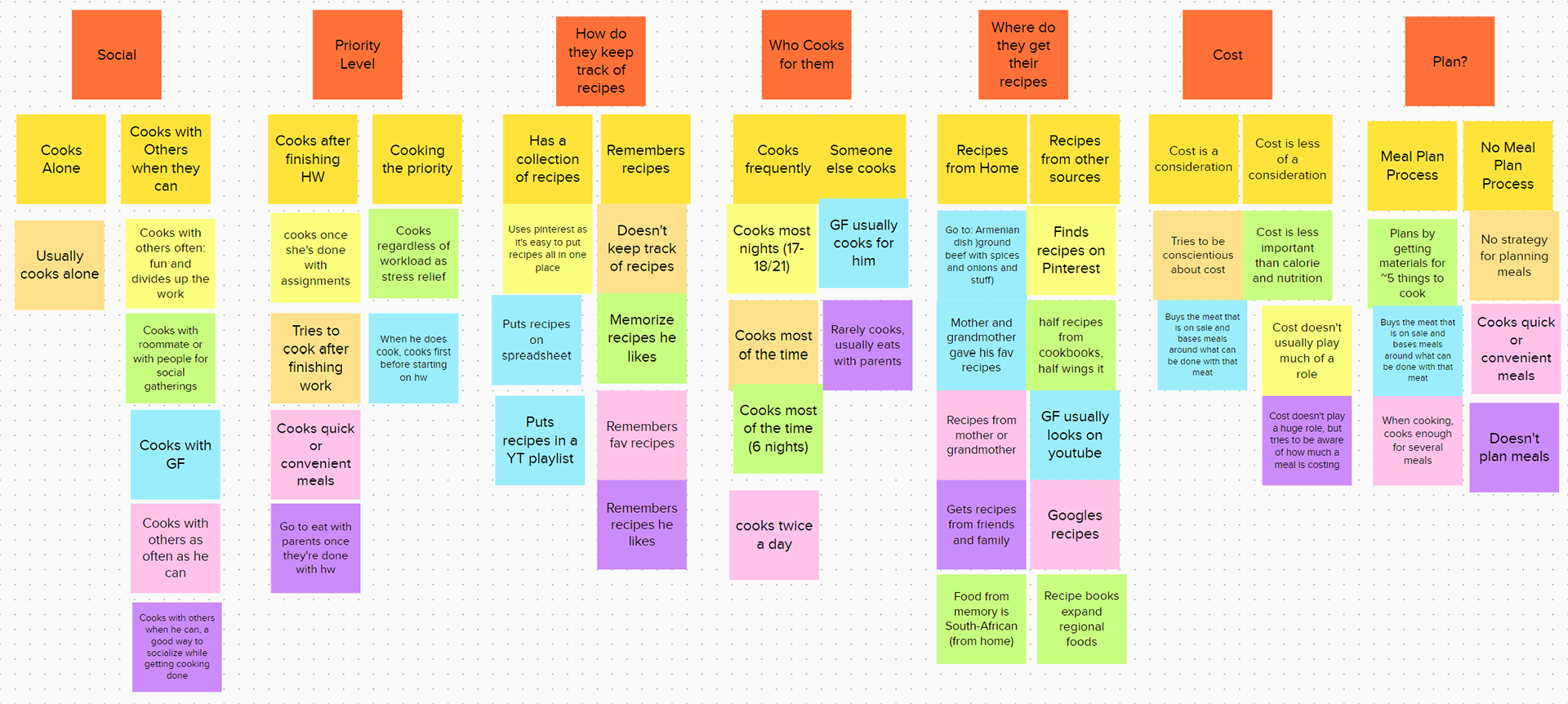
Common Interview Insights
‣ Cooking is a lower priority compared to schoolwork
‣ Recipes come from familiar sources or are recommended to them
‣ Memorizes or stores recipes in a collection
'How Can We' Statement
‣ How can we make cooking less of a time sink for those who are busy?
Design
Problem Statement
College students need a resource to make planning what to eat easier to manage because their busy schedules make feeding themselves an afterthought
Palette
As this app is focused on food, I wanted to design the color palette around colors we see frequently in food. When considering these colors, my mind kept returning to cream, lettuce greens, and roasted oranges.
From left to right we have Bistre, Chocolate Traditional, Alloy Orange, Maximum Green, Champagne, and Baby Powder.
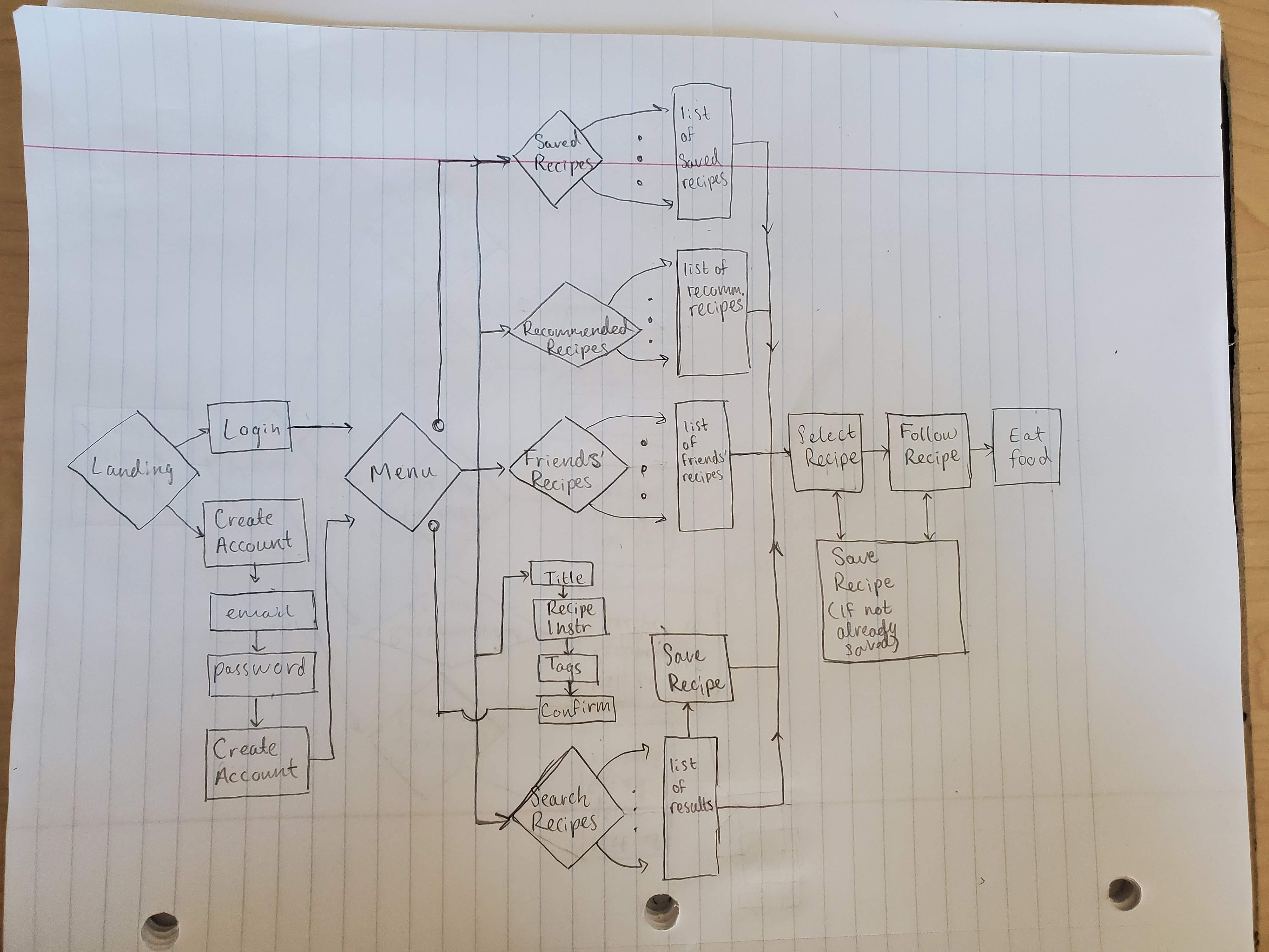
User Flow

Low-Fidelity Wireframes
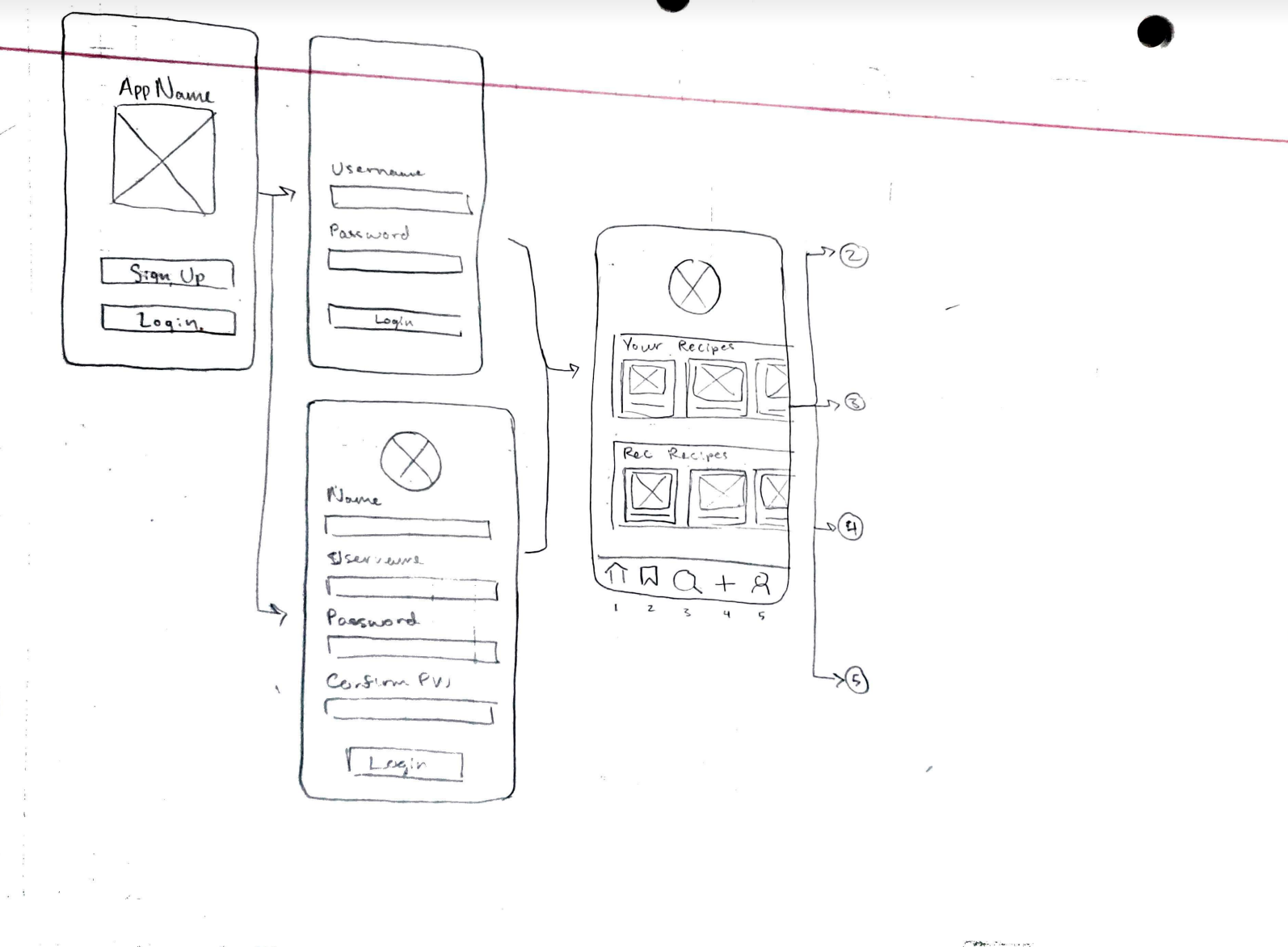
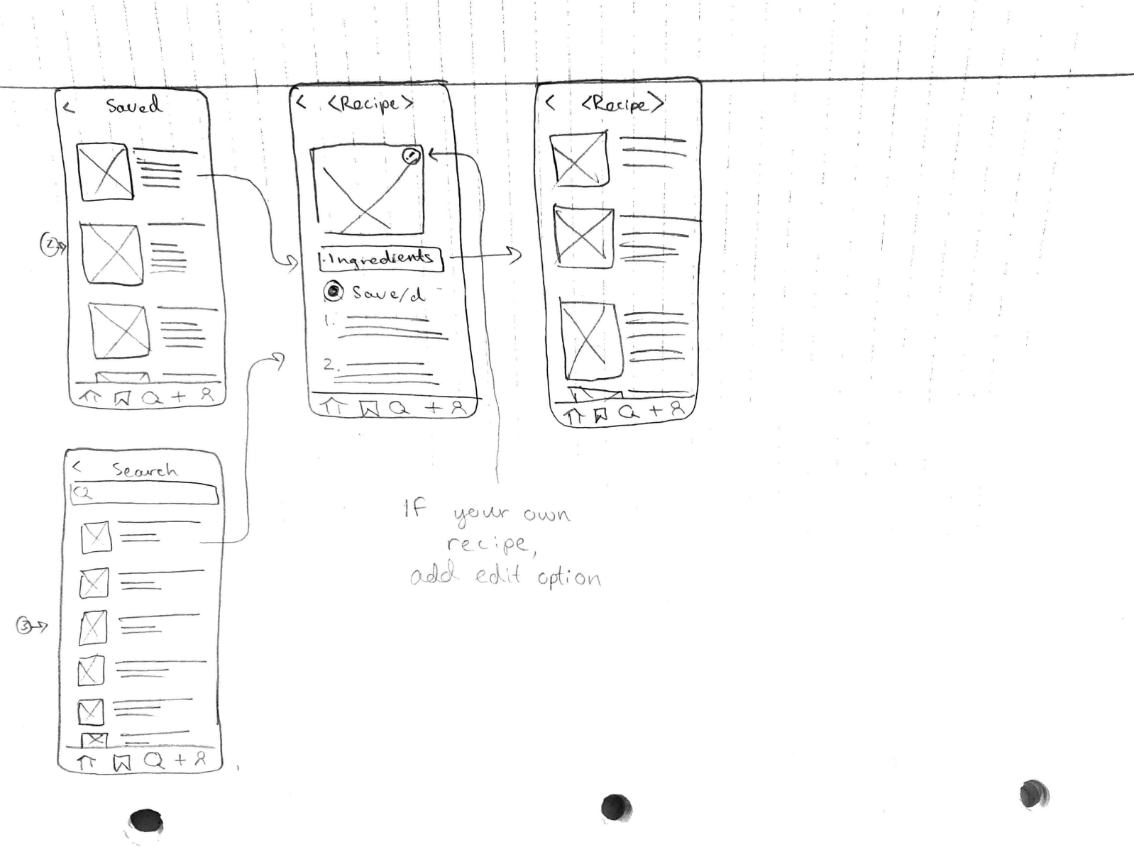
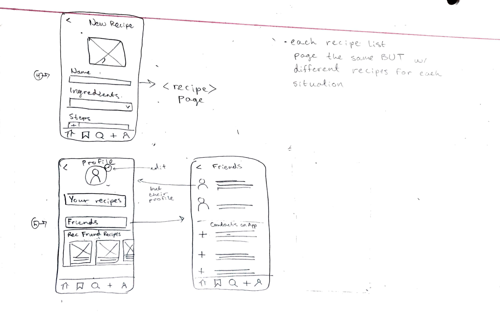
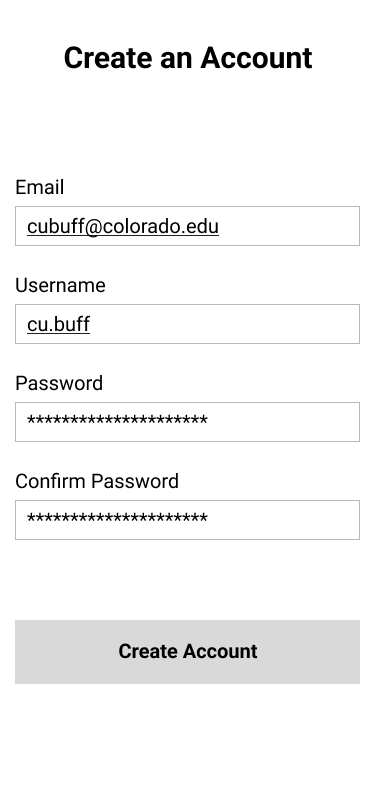
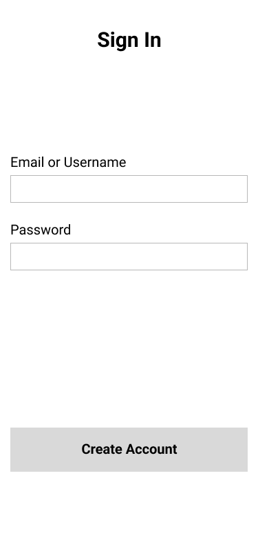
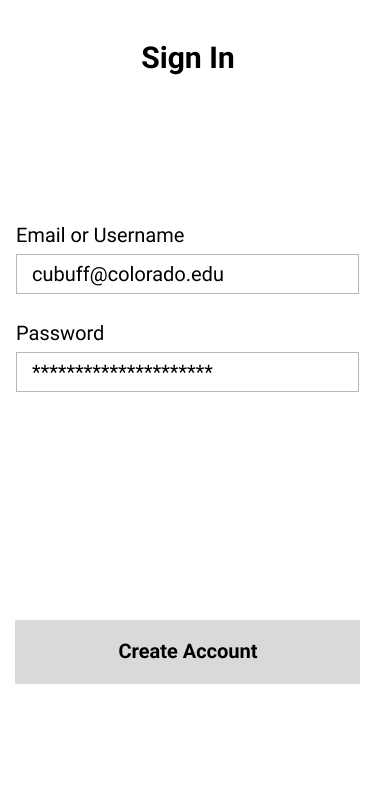
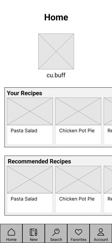
Mid-Fidelity Wireframes
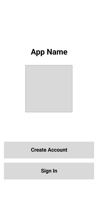
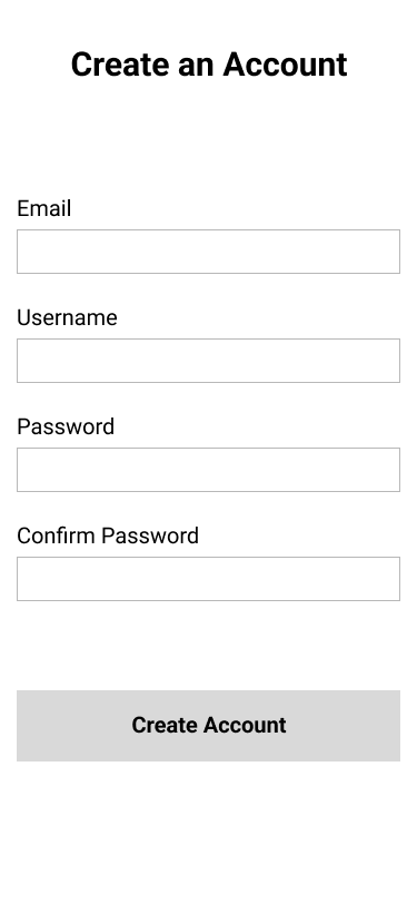


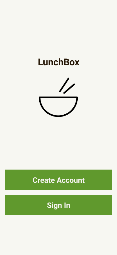
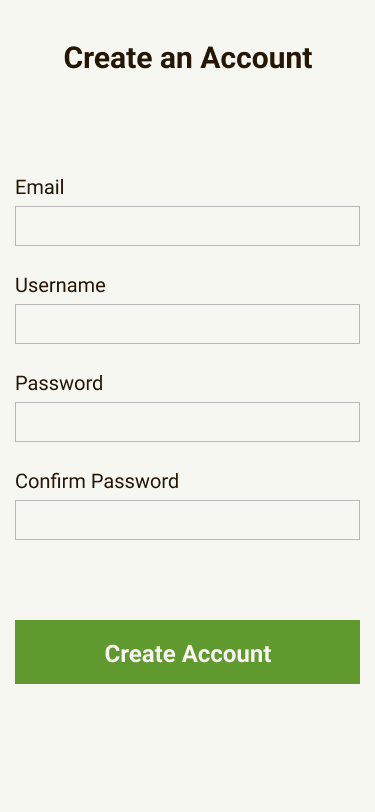
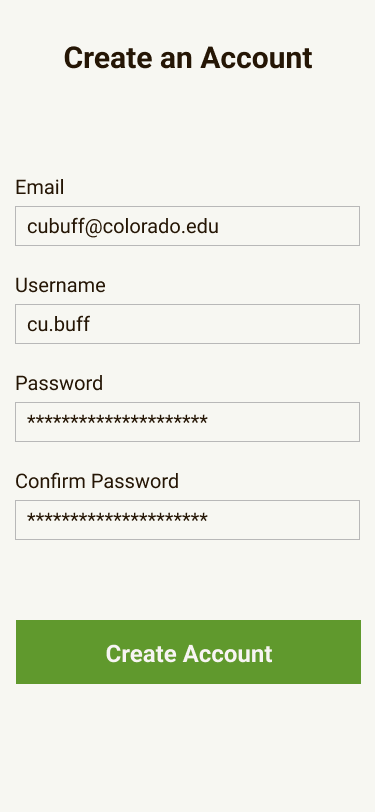
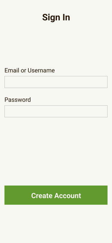
High-Fidelity Wireframes
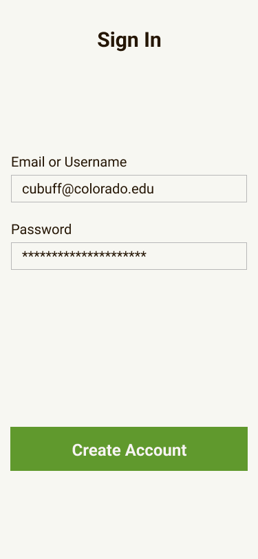
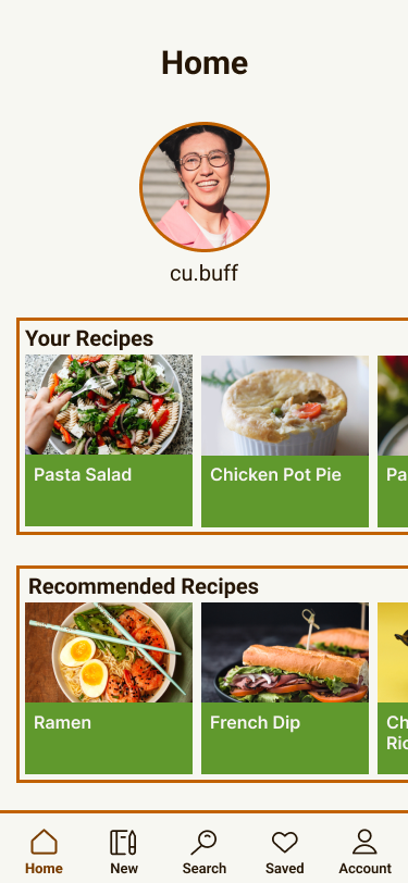
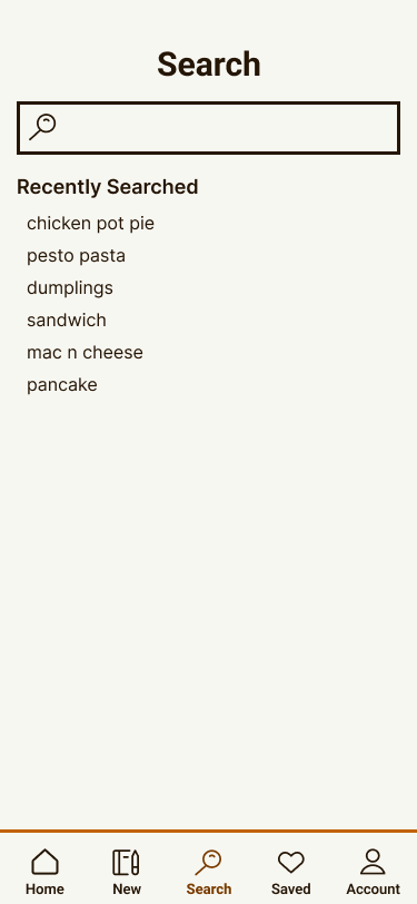
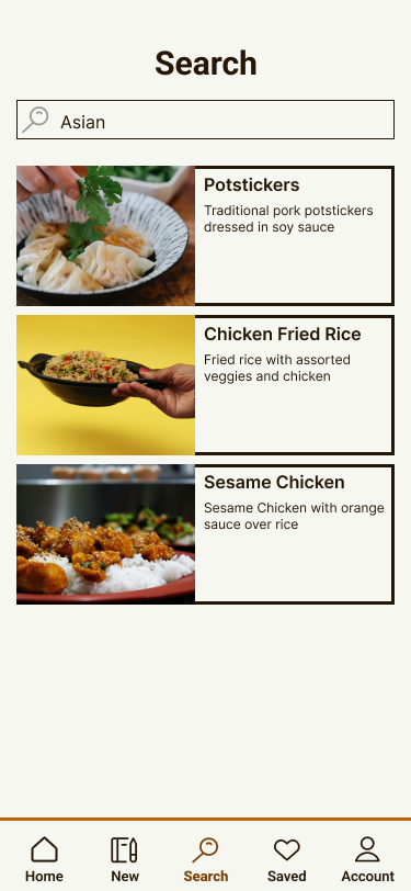



Interactive Prototype
Evaluation and Revisions
One point of critique I received was that on the navigation bar, the page connections were mapped onto the graphics and were hard to click. To fix this, I added invisible rectangles covering the graphics and linked the page connections to those, so that the clickable regions are larger
Color accessibility was another significant change made. Initially the background was Champagne, and the selected page on the navigation bar was Alloy Orange. These were changed to Baby Powder and Chocolate Traditional respectively. Prior to the change, the colors were too similar and did not pass the accessibility test.
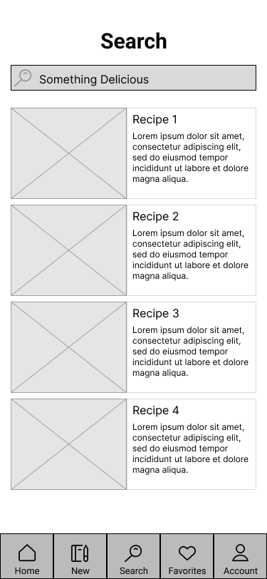
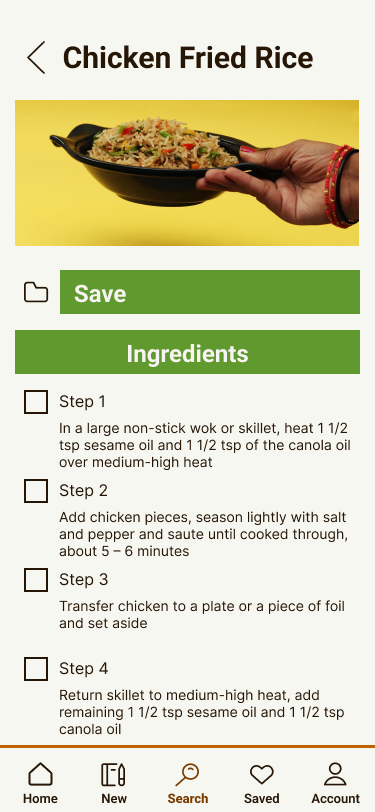
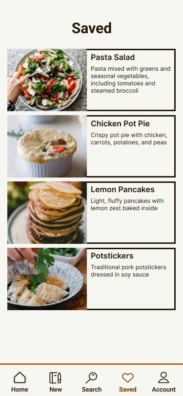
On the point of color, I also reduced how frequently Maximum Green was used. Before the change, the green was used as more of a secondary color, however it is more effective as an accent and or action color. It now appears primarily on action items, to attract the user to different items such as recipes, and buttons.
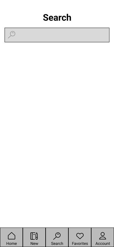
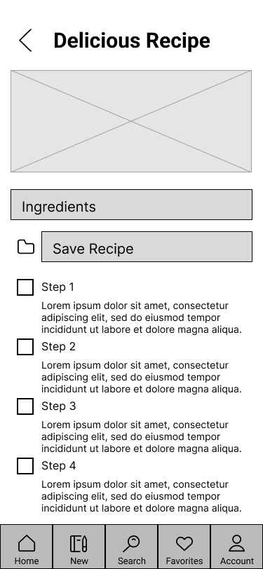
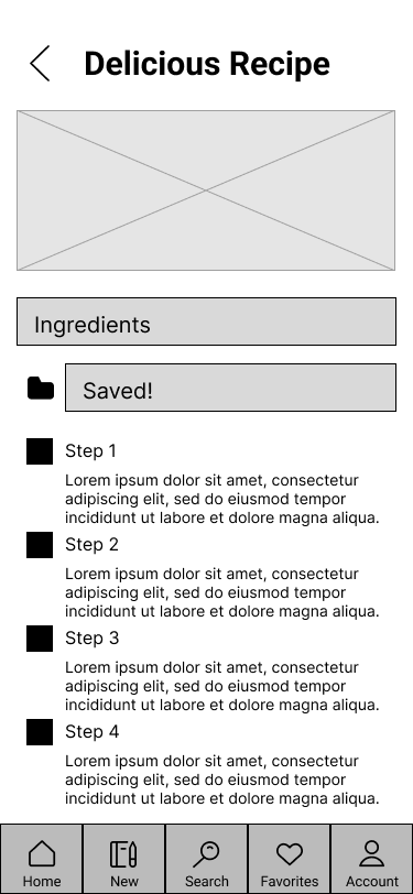
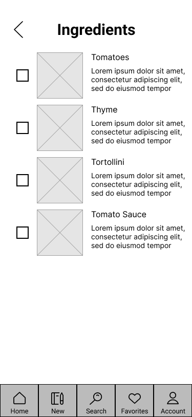
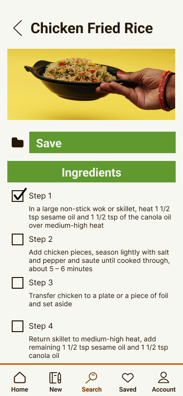
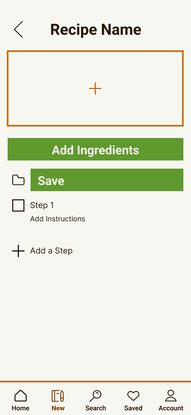
A usage change was made on the recipe screen, switching the page order of the ingredients button and the save button. It makes more sense to put the save button above the ingredients button, giving it a higher importance to the user.
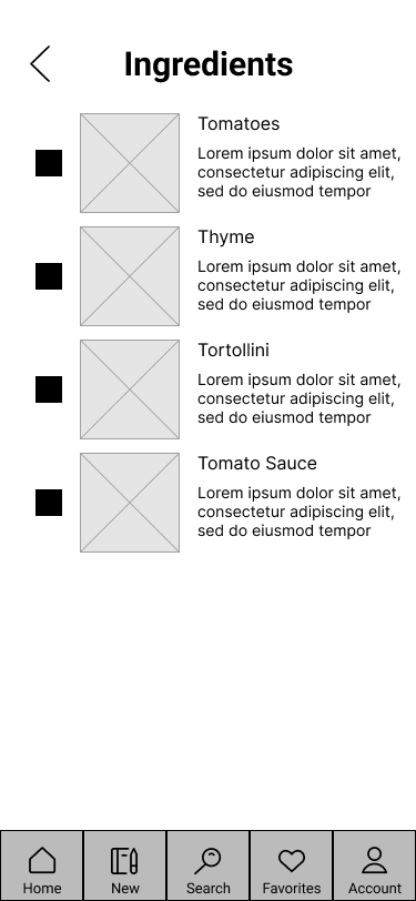
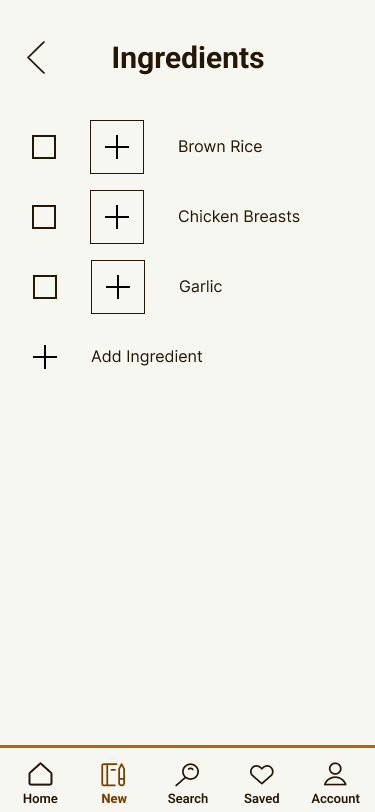
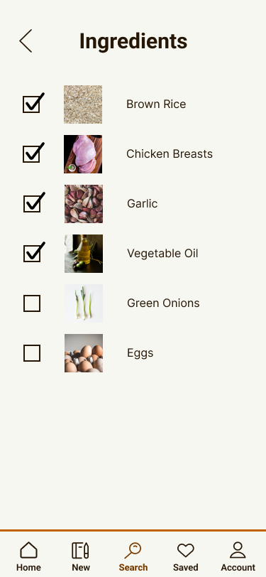
A few minor revisions were made to make everything more aesthetically pleasing, but they were minor visual tweaks, such as adding checkmarks for ticked boxes rather than simply filling them.
Conclusion
This is my first time bringing a UX/UI concept into any form of a polished product. The amount of time and effort that goes into making a design easy to use and something people would want to use is much more than I expected going into the project. After this project, I have gained considerably more respect for UX designers and the work they do.
Going Forward
I don't plan to progress this concept any farther, however I do think that it has potential. I think that with more polish, this is something that I would use and would help other students to easily figure out what they'd like to eat that day. Unfortunately, the individual still has to cook the food, however I believe that is outside this concept's scope anyhow.