The Denver Zoo's website serves as an information resource and ticketing site for the Denver Zoo. While the current Home page, Animals page, and Ticket Purchasing flow are usable, they lack cohesion, a unified design system, and streamlined usability.
I sought to reimagine these pages to make them more user-friendly without reinventing the Zoo's design system and website goals. Because the Denver Zoo's website is an informational hub for their location, there's a lot of pages to account for and unify. I hope that my redesign improves the experience for anyone curious about the animals the zoo cares for as well as unifies and streamlines the design system of the Ticket Purchasing flow.
Designer: Sam Lippincott
Role: UX/UI Designer, Researcher
Timeline: Mid August - December 2022
Tools Used: Figma, User Experience Metrics, Adobe Photoshop
Scope: A Figma proposal for alternative designs to three pages on the Denver Zoo website: the Home page, the Animal page, and the Ticket Purchasing sequence. I aim to make these pages more streamlined and easy to use.
RESEARCH
UX EVALUATION
Before I could start redesigning pages of the website, I first had to take a look and understand what was worth changing and what the website was doing well already. To do this, I ran a design audit on multiple pages, including the Home page, the Purchase Flow, and the website as a whole.
The audit asked questions under four different categories: Usability, Findability, Visual Design, and Content. Each category included questions probing the success of the pages under the category in question. Questions such as:
Are the navigation labels easily understood by the user?
Can a typical first-time user do the most common tasks without assistance?
Are the categorization and filtering labels clearly understood and do they clearly represent the linked items?
Is there a consistent use of brand colors and typography?
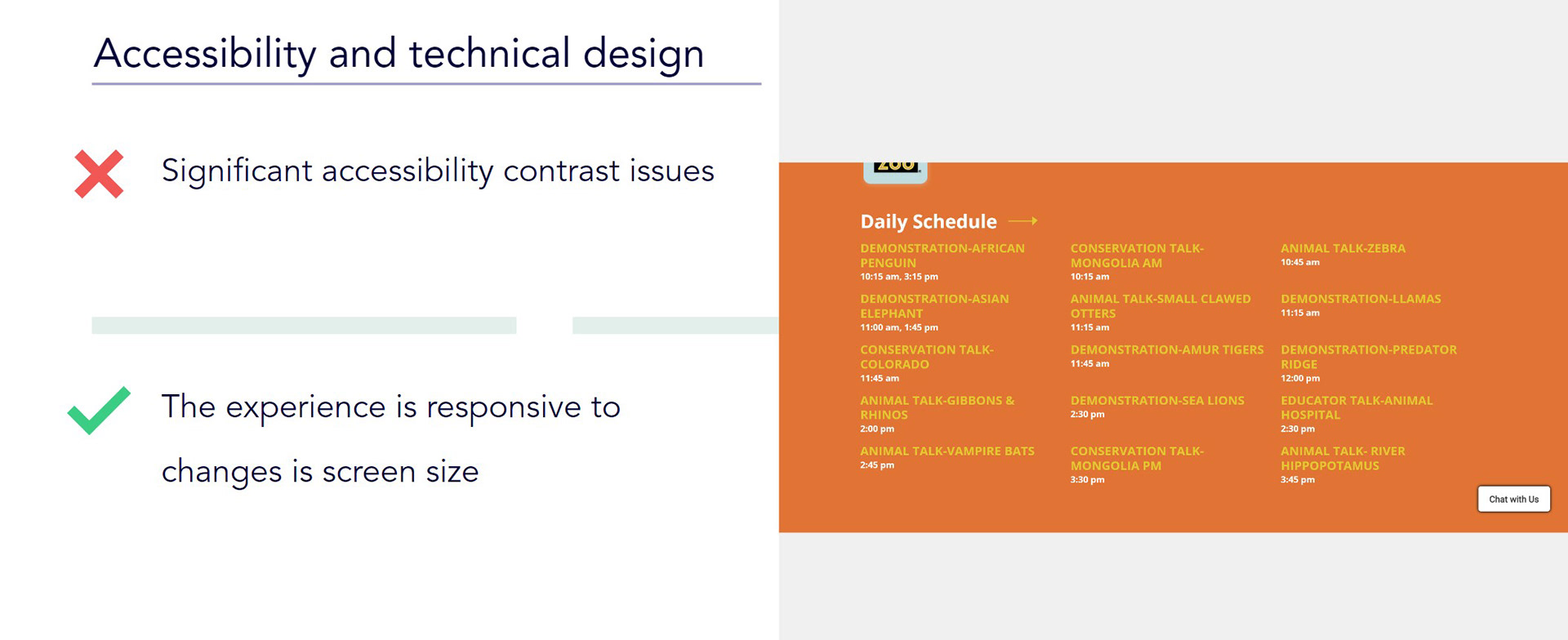
Does the site pass AA compliance when graded against WCAG 2.0 accessibility guidelines?
There were several significant problems I identified through undertaking this audit.
Firstly there were significant problems across multiple pages where the text color would be remarkably close to the background color, clearly not meeting AA compliance.
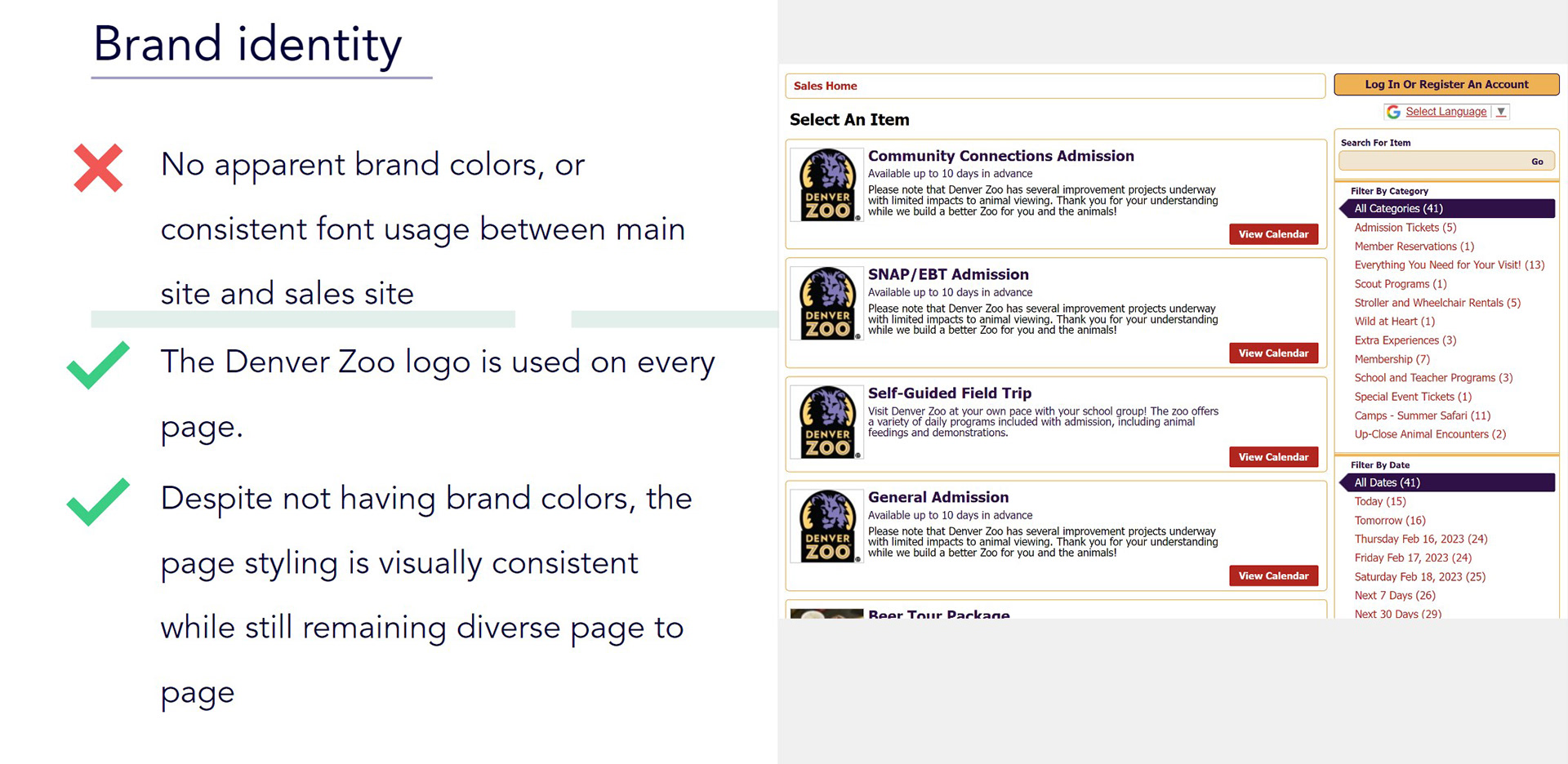
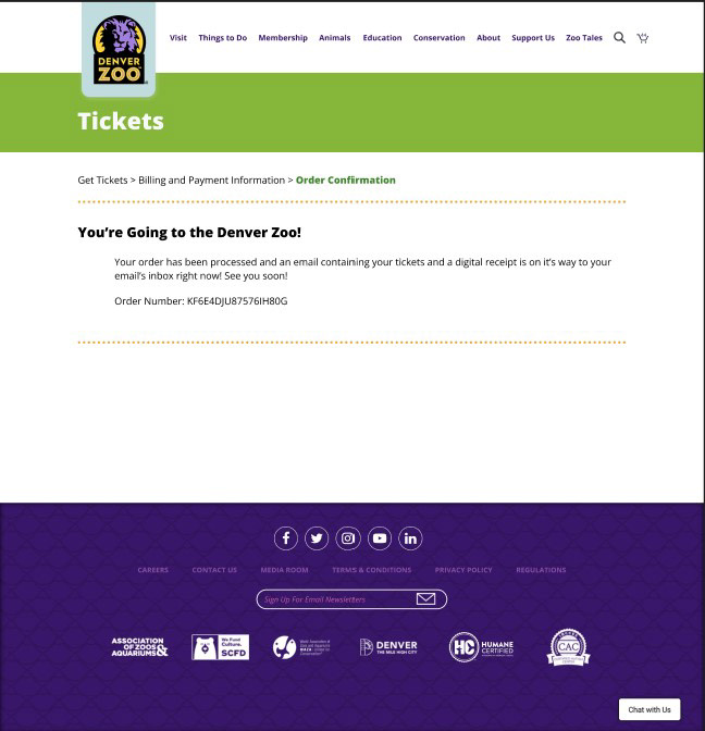
There was also a consistent lack of brand identity besides bright colors and liberal use of logo signage. The only identifiable characteristic of the Denver Zoo in the ticket flow was the use of the Denver Zoo logo for most items. Otherwise the styling, colors, and typography were all different.
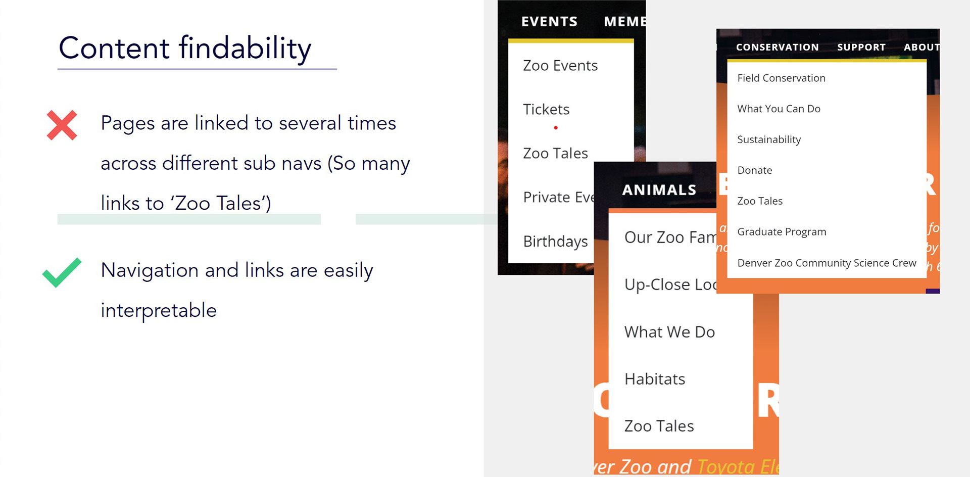
When considering the navigation bar, there was also significant issues with the amount of sub-navigation items in each navigation item's dropdown menu. To make matters worse, several navigation dropdowns contained the several of the same sub-navigation item. For example, like you can see to the left, 'Zoo Tales' appears in at least three of the navigation dropdown menus.
From these issues, I developed several goals in reworking a select few of the the website's pages:
- Compile information from separate pages that could be effectively organized onto one page.
- Establish a unifying brand color, typography, and aesthetic across pages including sales page.
- Streamline purchasing process with clear progress and cancelation options.
- Rework search, make it apparent when results appear, add “did you mean…” responses to no result searches
CARD SORT
Next, to gather information on the best organization of the navigation bar and it's items sub-navigation items, I conducted a card sort.
As this redesign project was done in parallel with several other designers, Using UX Metrics' Card Sort feature, we gathered all the sub-navigation items and resorted them into the main navigation's items, while also considering if there were any redundant items or any items that could be merged.
From this, I obtained a potential reorganization of the main navigation. The rest of the designers and I combined our card sort results to create a sitemap as can be seen below
SITEMAP
TREE TEST
To test my potential organization of navigation items and their sub-navigation items, I conducted a Tree Test, also using UX Metrics.
To perform this test, I first created several navigation goals for the users to try to find. I then set the correct path for these goals.
Next, to perform the test, I sent out a link to the test to as many people as I could, as I knew a larger data set would be more useful.
From this dataset, we could tell if our sitemap was successful. My tree test results were overall successful, with an average of 70% correctly finding the correct path to the designated information.
The path the test participants had the most trouble finding pertained to finding the Safari Camps sub-navigation item, with the majority instead navigating to Scout Programs and Camp Outs. This tells us that Safari Camps could and probably should be combined under the Scout Programs and Camp Outs page.
DESIGN
DESIGN SYSTEMS PATTERN AUDIT
A design system is a reusable element to create a consistent experience for the user. It is made up of elements, components, and patterns.
For this portion, I audited the existing Denver Zoo website to find examples of each pattern type. The patterns I collected were accordions, buttons, checkboxes, dropdowns, text inputs, links, modals, paginations, radio buttons, search fields, forms, filtering, cards, tables, and image galleries.
An example is shown below.
ANNOTATED LOW FIDELITY WIREFRAMES
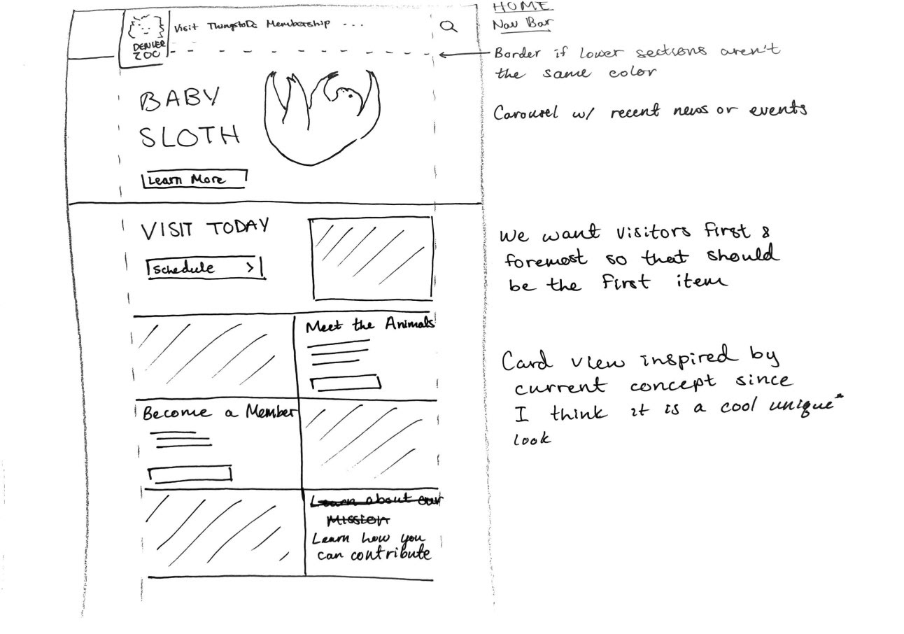
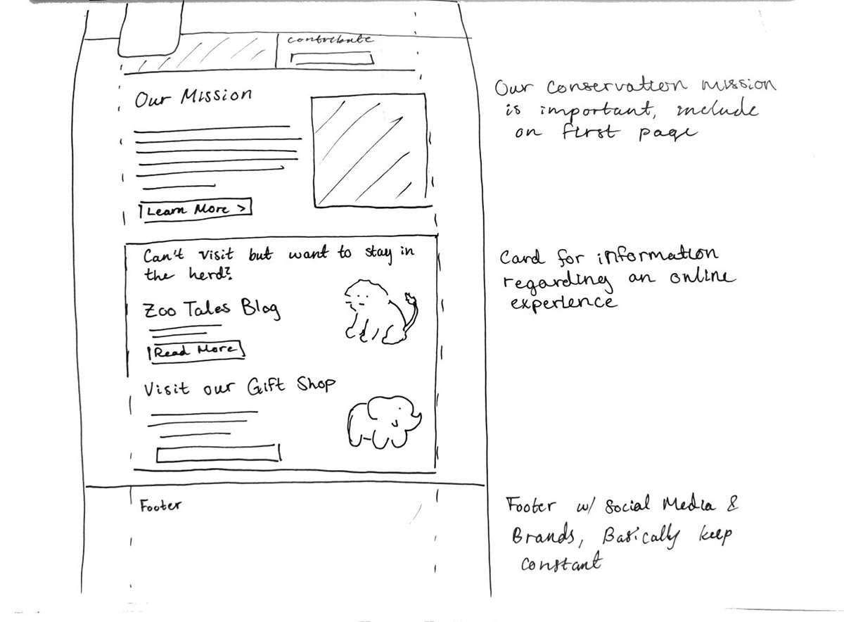
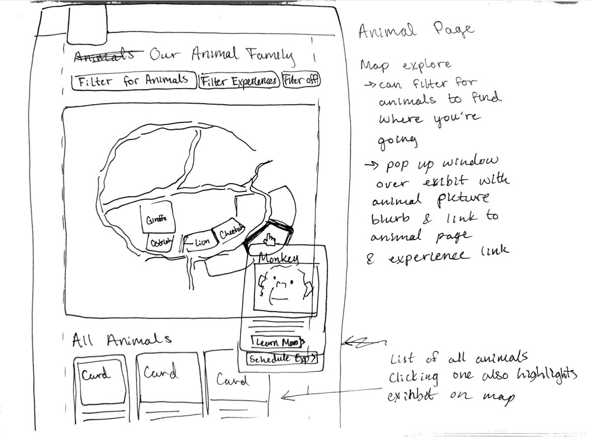
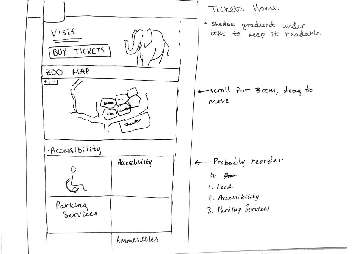
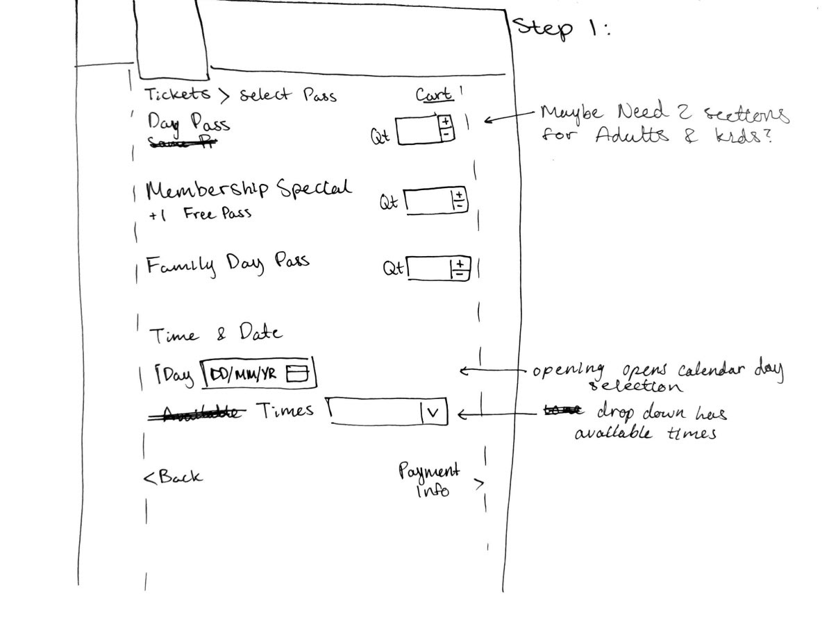
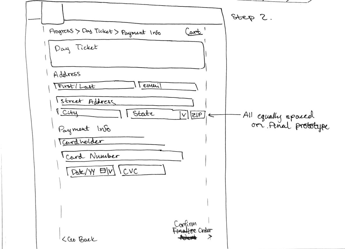
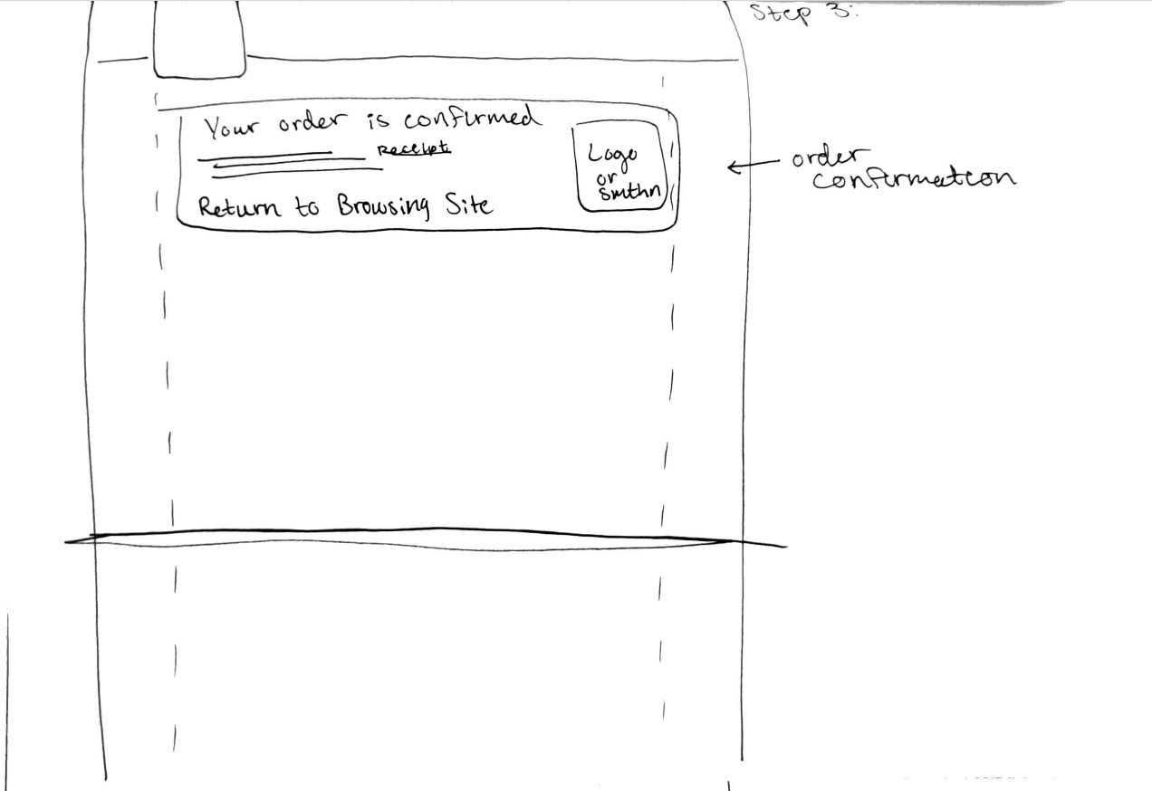
I created low fidelity wireframes for each page I would be redesigning, and annotated them to clearly explain why I made each choice that I did.
This was a very valuable step as after drawing these I realized I missed some important details such as the actual prices of the admission tickets. It was also very useful for brainstorming purposes, as with a simple drawing it's easy to scrap. If you jumped straight into a high fidelity prototype, it would be a hassle to rearrange your page if you found an issue along the way.
Home Page Low Fidelity Wireframe
Animal Page Low Fidelity Wireframe
Purchase Flow Low Fidelity Wireframe
HIGH FIDELITY INTERACTIVE PROTOTYPE
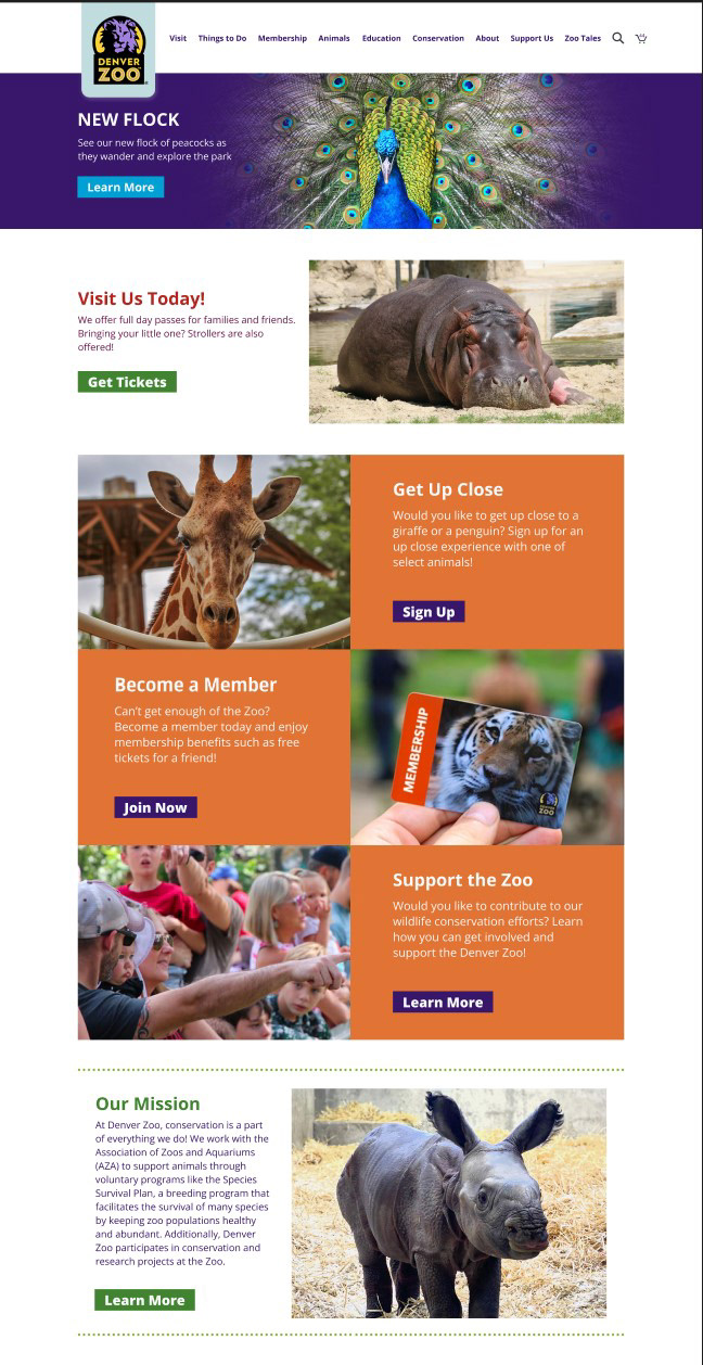
After completing the low fidelity wireframes, I received feedback from my instructor and started my high fidelity wireframes with the feedback applied. Several things about my low fidelity wireframes needed to be changed when building the high fidelity prototype for various reasons.
An example of this is that it seemed unnecessary to have the map on the Visit landing page as well as the Animals landing page. Another example would be that I forgot to clearly represent the prices of admission tickets and services.
My instructor created a design system essentially lifted from the actual Denver Zoo website for my fellow designers and I to use in the high fidelity prototype. This included a unified color system to use as well as the patterns, components, and elements.
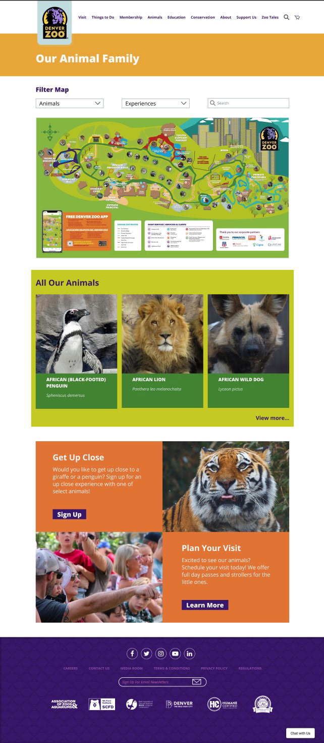
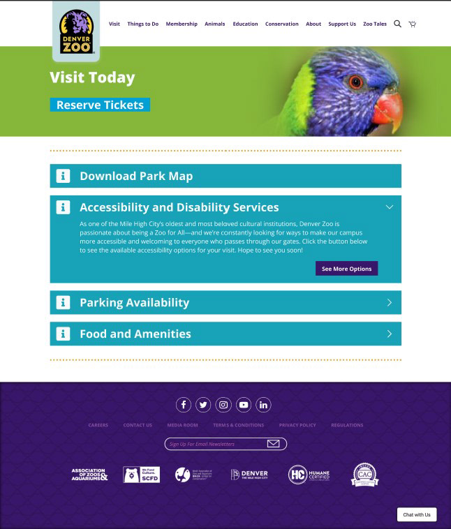
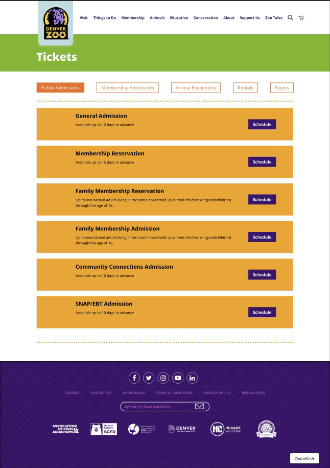
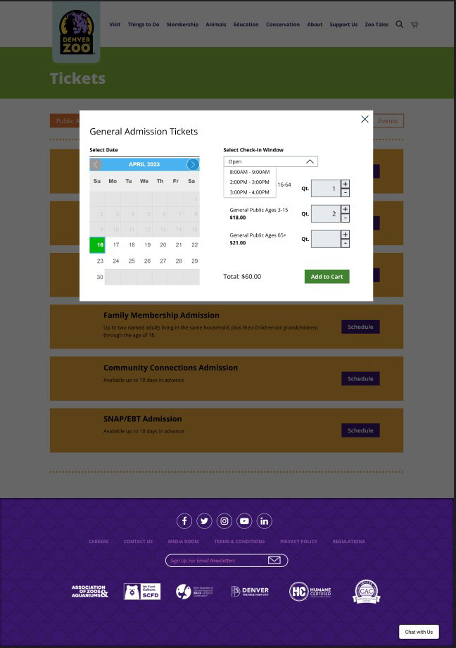
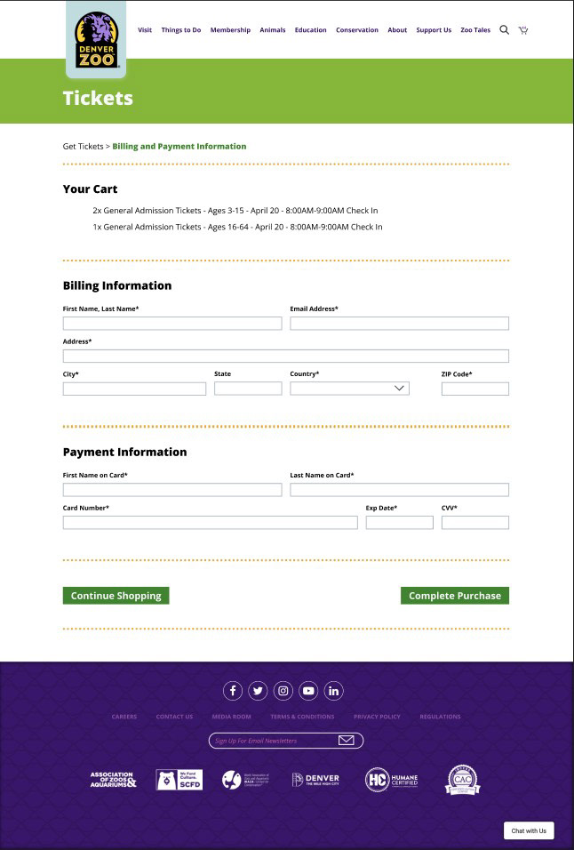
I think it's also important to highlight the concept I was going for on the Animals page with the interactive map. My intent is that when you hover over an exhibit on the map, a popup (like the one shown below for a penguin) will appear with brief information about the animal within the enclosure on it. Also, if you click on an animal card below the map, the enclosure that animal can be found in will be highlighted on the map.
INSTRUCTOR FEEDBACK
Much of the designer feedback came down to the three same points: rearrange content, correct color accessibility issues, and to reduce font size in some places.
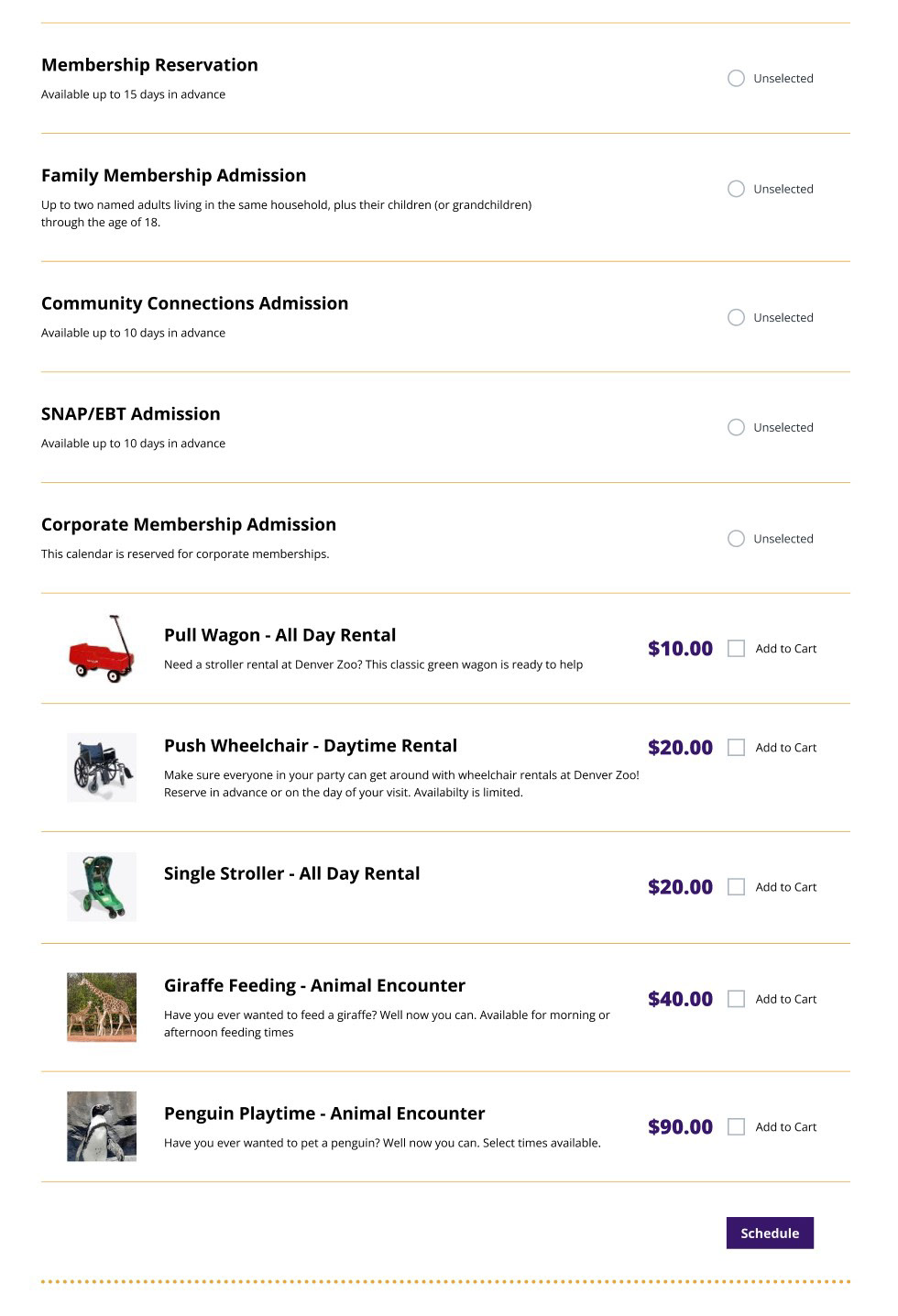
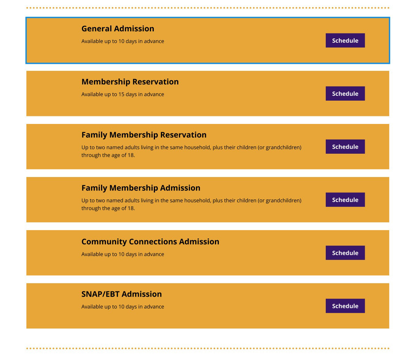
Most of the rearranging came on the Ticket Listing page as it was a bit overwhelming having so many calls to actions and bright colors. This I simplified by cutting out the box around the ticket item and simply adding an orange dividing line between items. To reduce the number of calls to action, I made each item selection either a radio button or a checkbox for the items that are add-ons. Then, to add the tickets and add-ons to your cart, there is a button at the bottom of the page for you to schedule your visit. These changes made the page much easier to look at, not feeling so overwhelming and cluttered.
I had many contrast errors, some of which I wasn't even aware were inaccessible. It was very eye opening to see what color combos I had previously believed to be accessible were actually not. I should say, some errors came up in the design system itself, such as the number of items in the cart not passing AAA compliance. I left this as is as adjusting the design system was not part of my mission.
On the home page I reduced the text size of several cards as that would increase the notability of larger text sizes.
Below you can see the before and after of the Ticket Listing page which saw the most drastic aesthetic overhaul of any of my pages.
EVALUATION & RESULTS
USER TESTING
I performed three user tests to determine how my prototype faired under general use.
For each page, I asked each participant to describe what they believed the page was trying to communicate, if anything on the page was unclear or confusing, and also if they thought anything was missing from the page. Before moving to the next page I would also ask them what they anticipated being on the page they would be navigating to to get a sense of if my page was maybe lacking something they would naturally expect.
The most notable points of feedback were that the Zoo's hours should be shown prominently, the total purchase cost needs to be on the checkout page, and it would be nice if ticket prices were more prominent.
PROPOSED SOLUTIONS
To recap, the most notable and consistent suggestions were to add the Zoo's hours to the homepage in a prominent location, add the cart total to the checkout page, and add a price to the admissions tickets on the tickets page.
The first two can be easily added. The official website has the Zoo's hours on the navigation bar and I think that is a great idea. The total not being on the checkout page was something that slipped my mind when I was building the prototype and is something that can easily be added.
The other point requires a bit more consideration as a ticket will have a different price depending on your age. So, putting a singular price for a ticket on the ticket page feels like it's hiding useful information, but showing all three prices seems clunky. I'm thinking the best solution would be to put the price of the adult tickets on the ticket page and save the price listing for the modal that pops up for you to schedule your tickets.
Two other mentions that I thought were interesting were a way to show the weather on the schedule pop-up and a way to show how many tickets have been sold for each day so you can see how busy it will be. Both of these ideas are great and have real potential, but they would likely require a rework of the layout of the scheduling modal.
We were not meant to implement the changes the feedback prompted, thus these proposed solutions have not been implemented, but could be if I was to continue the project past the deadline.
REFLECTION
If this project were to continue, I'd continue to tackle pages on the website that need overhauls.
Most of the pages are acceptable but can certainly be improved and updated. One page that would require a lot of work would be the online gift shop. Currently, much like the ticket sales flow, the styling is completely disconnected from the main Zoo website, with little to no uniting features. I would try to align the online gift shop with the new design system I've worked with here, unifying the colors, type, and general look.
This project sought to redesign the online Zoo experience with a pre-made design system. When you need to redesign a design system as well as the page it's for, it feels like a constant juggling act. Building with a pre-made system was an environment that was much more conducive to creativity. I was able to devote much more of my attention to the actual look and feel of the pages.
When beginning the project, I did not notice much about the website that felt like it needed to be redesigned. By utilizing design audits, card sorts, tree tests, and user testing, I was able to look at the features of the Zoo website much more objectively and critically. My view of user experience design was shifted from a branch of subjective aesthetics to an objective science.